Indie Rock: Shovel Knight
- Updated: 23rd Jul, 2014

Every time I attempt one of Shovel Knight‘s classically inspired 2D platforming levels designed with modern sensibilities in mind I do it perfectly; finding all the secrets and avoiding impossibly foreseen danger like I’m some kind of Wizard, Fred Savage or otherwise. This is because every time I die I quit out to the main menu and restart the stage from scratch.
There’s a system where you’re able to destroy checkpoints for an immediate tax free cash reward that you can invest in more health or magic or other video game shit. When you inevitably fall to spikes or traps or exploding rats you’ll be sent back to the last non-destroyed checkpoint. For me, this is the entry screen, the titular Shoveled Knight-man jauntily leaping on-screen from stage left and brandishing his part-weapon part-gardening apparatus.
Each time you die you also drop a portion of your net-worth, needing to collect it again in a single run or it disappears and is replaced with the lost spoils of what then remains in your possession minus the planned overdraft fee.
Or so I gather, because damned if I’m taking that risk if I don’t need to. Nope. Quitting out to the map select screen. Let’s try this shit again.
It’s a good system, even if I’m cheating it like I’m hiding a Gameshark up my sleeve and laying down five aces on the table. It’s an attempt to make death a more meaningful experience and answers a lot of concerns I have about the nature of repetition as game design. Repetition is the game asking you to prove you understand an idea before you can continue, death is your way of replying that you haven’t grasped it yet, while Loss is the incentive to learn from your mistakes quickly.
Often I think that failure is enough of an answer in itself. Like, okay, I don’t understand or I’m not skilled enough to progress, let’s consider that as the endpoint of this discussion. What now? What if the point is proving that I’m awful at this and it’s too hard? Play Dys4ia and Cart Life and I Get This Call Every Day, is what I’m saying.
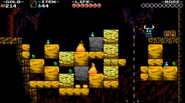
 Shovel Knight does a lot to distance itself from the idea that it’s nostalgia-bait with systems like this Dark Soulsy But Actually A Little More Evil thing. In art design it’s deliberately invoking that limited palette NES aesthetic with some fair improvements like parallax scrolling and music channels that don’t cut out to accommodate the need to play sound effects. It’s still asking you if you’ve played Mario 3 and Zelda 2 and Megaman 2, but if you haven’t it’s not shutting you out of the conversation. Instead it’s making room for you and taking time to explain some in-jokes.
It’s not just sticking to the design of those games, it’s using their tropes and even going a step further. Every level does one or two things that are totally unique. One of my favourite mechanics is a platform (I think it’s in the King Knight stage?) that will lower itself when enough weight is on top of it. You’ll either need to ensure that you aren’t dropped into the bottom of the level and killed by standing still, or pushed into spikes at the top by lifting your weight off or killing too many enemies. The first time you see this it displays both of these design ideas in the same room! The game introduces an idea and then immediately subverts itself! It’s so confident in the knowledge that it’s got more ideas to show off later!
Shovel Knight is great. It’s a stellar blending of old and new design perspectives. You’ll like it if you’re into challenging platformers of old and you’re a massive nerd about design like me, your pal Mat Jones.
Shovel Knight is out now on Windows PC and also available for Wii U and 3DS in North America.

Follow Us!