The Legend Of Zelda: Ocarina Of Time 3D – Hands-On Preview
- Updated: 25th May, 2011
 It was like Christmas had come early. On the 13th Dec 1998 the much-delayed Legend of Zelda: Ocarina of Time was finally released in the UK. This was a day one purchase for me. I remember spending many, many hours immersed in the wonderful world of Hyrule, until I finally saved the Princess. Happy times.
Now, 13 years later, Ocarina of Time is back, but on the 3DS. I was very curious to find out if the game that is often referred to as the “greatest game of all time” still has what it takes to be a great game in 2011 or is it a classic of a time gone by. So last week, amongst the many branches of the great Deku tree and , I got some hands-on time with the game.
21st Century Link
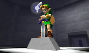
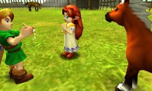
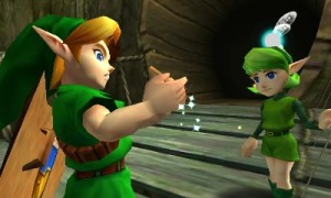
 This new 3D version of Ocarina of Time is a bit of an eye-catcher. Boasting an updated graphics engine, Zelda impresses from the get-go. It looks exactly like the game I remember playing all those years ago, which is funny as the original N64 version now looks terrible. I checked, by playing Zelda on one of the N64s in the event’s nostalgia area. Zelda 3D was like reuniting with a long lost friend; so many things were familiar and comforting, especially the music. To see Link riding aloft his horse, Epona, who was majestically galloping across the vast Hyrulian field… it brought back waves of happy memories. It even sparked the notes to Epona’s theme back to life in my brain. The very same notes that I used to play on Link’s Ocarina whenever I wanted Epona to give me a lift.
I spent a while flicking between the 2D/3D modes to see what view I was most comfortable using. The full-on 3D view really showed off the impressive depth of field. This did bring a whole new dimension, if you forgive the pun, to the battle sequences. Those pesky PeaHats that infest Hyrule field are a perfect example of this, with their spinning blades appearing as if they pop right out of the screen.
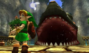
The N64’s controls have translated fairly well to the 3DS, with the LB taking the place of the must used Z-trigger for locking onto items/enemies. The touch screen allows you to quickly navigate between your items, the world map and your weapons. After all these years, Nintendo have finally sorted out how to quickly switch between the longshot and the iron boots. This one simple change makes the whole Water Temple an infinitely nicer place to be as you need to use both items almost all the time. On the original, it was a bloody pain. Just ask anyone whose completed it.
The circle pad on the 3DS takes the place of the N64’s joystick and is a very poor replacement, to be honest. Whilst the pad is nice enough for making Link walk and run around, it’s bloody awful for aiming when using any ranged weapons – bow, catapult, longshot. It’s not sensitive enough. But using the in-built gyro and physically moving the 3DS console around to aim in first-person view is far more accurate way of doing things. However, this can get a bit tiring after a while. It’s also best to use the 2D mode as it’s very difficult to maintain the correct alignment between your eyes and the screen for the 3D effect to work properly.
Same dungeons, different puzzles
Happily, there is more to discover in this 3DS version of Ocarina of Time. For starters the Master Quest add-on is included. In this add-on, the basic game play, locations and events of Ocarina of Time are the same, but once you get into each of the dungeons things are different. Each dungeon has been comprehensively redesigned to make them much more of a challenge. For Ocarina of Time veterans like me, these new puzzles are a very welcome addition.
There is also a new boss challenge mode which allows you to refight any boss you’ve already defeated. Either on their own or as a series of continues battles. Modes like this have never been much of an interest to me. I’m usually quite happy to see the back of most boss battles. I really don’t want to have to fight them again, especially by choice.
Thankfully, Nintendo have addressed one of the major flaws of the original – what the hell to do next? We’ve all been there. You’ve just completed a dungeon with your shiny new weapon and then you have absolutely no idea where to go next. Instead you waste loads of time wandering around the world map before stumbling on the next area/event. This new version includes various Sheikah Stones dotted around Hyrule which give you hints and tips to help you with your adventure.
Nostalgia is a wonderful thing, but as I mentioned from the start, it frequently suffers at the hands of reality. The 3DS version of Ocarina of Time avoids this problem to a certain degree by updating the visuals, adding new challenges to the existing dungeons (via Master Quest) and providing help to lost adventurers. However, the tedious adventure sections in-between dungeons and painfully slow conversations between Link and the numerous NPCs still blight the game. In fact, the game would be substantially better if Nintendo just linked all the dungeons together. That maybe a blasphemous statement to legions of Ocarina of Time fans out there but the game play outside the dungeons has not aged well at all. In-game narrative and character interaction has come a long way in games since 1998. Ocarina of Time’s stilted dialogue and clumsy plot exposition match up very poorly to modern games like Heavy Rain, Mass Effect and Portal 2.
Summary:
The graphical lick of paint and the prospect of solving a whole new set of dungeon puzzles are probably just enough to tempt veteran players back to Hyrule. For new players, this is the best version of Ocarina of Time to date and is worth seeing what all the fuss is about, even with the flawed and slightly dated adventure sections.
Screenshots:
The Legend of Zelda: Ocarina of Time 3D is released on the 17th June 2011 for the 3DS.

Follow Us!