First Impressions: Dead Space (iPad, iPod Touch/iPhone)
- Updated: 24th Jan, 2011
I got my hands on both the iPad and iPod Touch/iPhone versions of Dead Space at a Dead Space event a few days ago thanks to EA. I’m not going to talk about the plot, or include any spoilers; instead I’m going to cover what they are like to play. [Novel idea for a games website, eh? – Ed]
iPad Version:
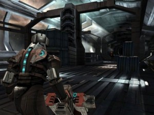
The first thing you notice when playing Dead Space on the iPad is how gorgeous the whole thing looks. You know that Epic Citadel demo, where all you could do was roam freely around a pretty looking castle. Well, replace the castle with a space ship, add lots of horrible looking Necromorphs, add gameplay and you’ve got Dead Space iPad. Yes, this Dead Space game does look that good. I would say that the iPad version is comparable, in graphical terms at least, with the PC /consoles versions of Dead Space. EA have really put the effort into making the these particular Dead Space games look amazing. Also I didn’t notice any slow-down at all, even with several Necromorphs trying to rip my body apart. Very impressive.
The second thing you notice is the game is not on rails. You can wander anywhere you want on the ship, which to be honest, tends to be up and down corridors. But still, it’s free roaming all the way. The control method is deceptively easy to use. I don’t have an iPad and I’d used one for about 5 minutes before I got to grips with one running Dead Space, so I’m no iPad ninja by any means. But within 30 seconds, I’d sussed out almost all the controls. Your left hand controls character movement with your right hand controlling the camera. Fairly simple so far. As there were no visible on screen controls, I just grabbed the iPad and started moving my character and aiming quite instinctively. You can practically grope any part of the screen to control your charter. It’s all been well thought out and implemented. Tap the screen to shoot and tap over the weapon in use to reload. There is also a automatic reload setting which saves you the hassle of manually reloading all the time. Yay.
When you get up close and personal with the Necromorphs, which is a common occurance, you get to use your new plasma saw weapon. Arrows appear on the screen showing which way to swipe your finger in order to carve up the nasty Necromorph. These arrows also reappear when you are within stomping range of an object/body. The only problem I had initially was swiping my finger in the right area of the screen. I just kept missing the arrow, but after a few attempts I quickly got the hang of it. I think I was a little afraid of dropping the shiny iPad on the hard floor as I was standing up whilst playing.
Doors and lockers are easily opened or closed through tapping the screen when facing them. The HUD is hidden by default (nice touch), and can be shown by tapping once on the top right of the iPad screen. From the very simple HUD you can do a variety of things. You can select your different weapons (tap top right), activate the locator to see where to go (tap bottom left), use a power node (tap bottom right) and pause the game (tap top left). It is all very simple, unobtrusive, easy to use and nicely designed.
For the commuters amongst us, you will be pleased to know that the game automatically saves your progress at all times. Saving anywhere and at any time is an essential feature in hand-held games, though you may find yourself disturbing other passengers during Dead Space’s many scary/jumpy moments.
Even those people who haven’t played Dead Space before on the PC or consoles will find it extremely easy to play Dead Space on the iPad. The controls are simple and intuitive and before you know it you will be strategically dissecting Necromorphs in no time. Certainly a game worth playing and it makes a nice change from Angry Birds.
iPod Touch/iPhone Versions:
The iPod Touch and iPhone versions are almost identical to the iPad version, just on a tiny screen. Unsurprisingly, the controls and the gameplay are just the same. It did take me a few minutes to get used to the smaller screen after playing on an iPad, and moving my sausage fingers in such a way so that I could see what the heck was going on was tricky. However, I quickly got in to the swing of things and soon I was blasting every Necromorph I could find. This game is a total breeze to control.
As far as the graphics are concerned, take a gander at the video below to see them in action. Yes, it really does look that good!
Overall, I was very impressed with Dead Space on the iPad and iPod Touch/iPhone. The quality of the gameplay and the effortless controls exceeded my expectations. It is always nice to be surprised by a game every so often, just like I was with the first Dead Space game on the PC and consoles. I’d highly recommend checking these great mobile games out later on this week when they see the light of day on the App store.
Dead Space is released on the 25th Jan on the App store for iPod Touch, iPhone (both £3.99) and iPad (£5.99).

Pingback: Battlefield 3: Aftershock – First Look (iPad)The Game Critic