RF Online Beta
- Updated: 23rd Feb, 2006
![]() RF Online ships this week. I fired up the RF Online beta last week and puttered around as a Cora Ranger for two or three hours – I couldn’t find a single reason to continue playing it. I realise that it was still unfinished but this game sucks like a Dyson!
RF Online ships this week. I fired up the RF Online beta last week and puttered around as a Cora Ranger for two or three hours – I couldn’t find a single reason to continue playing it. I realise that it was still unfinished but this game sucks like a Dyson!
The bad:
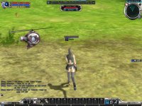
- HUD map looks like a SONAR reading – no landmarks, just blips for people.
- No detailed local area map or visible signposting, so I spent 10 minutes wandering around in circles trying to leave the town.
- No automatic attack – you have to keep pressing the fire button. That wouldn’t be so bad, but…
- No reload time indicator – I have no idea how long to wait before pressing the fire button again will do anything!
- No blood when I shoot something – okay, that’s just me being evil.
- No HUD ammo indicator – how do I know when I’m running out?
- Running speed is waaaay too slow for the size of the game. Just walking across town is tediously boring because…
- Pathfinding sucks – characters can navigate around pillars but can’t cope with corners.
- Viewing distance is appalling – even at highest setting you don’t see creatures until you’re practically on top of them.
I could be wrong on some of these, but the basic tutorial was rubbish! It took me through the intricacies of adjusting gamma and detail in the options menu (move scrollbar left or right!) but nothing really useful. By the time I’d crawled my way out of the city at snail’s pace I just couldn’t be bothered to explore any farther. There could be the most intricate and emotionally engaging story ever written behind that game, but if I have walk through this world to get it… I’ll pass, thanks.
Oh yeah, and in the space of 10 minutes, I had three kills stolen by other players. Urgh…
The good:
- The concept – magic + technology is usually pretty cool, right?
- The atmosphere – I like the (optional) public announcements for departures and ticket-buying in the station.
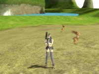
- Creatures look good.
- The huuuuuge metal thingy in the character selection thingy makes mechanical clanky noises. I like machinery, okay?
- Drops are assigned to players.
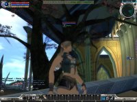
- The artwork associated with this game is breathtaking. Pity it doesn’t make it into the backgrounds.
Pity the gameplay is rubbish. I much prefer Guild Wars with its fast-paced combat, no kill-stealing, automatic basic attack, skill reload indicators, fantastic backdrops and general all-around goodness.
Screenshots:


One Comment