Hands-on with the Xbox One and PS4 Controllers
- Updated: 26th Jul, 2013
I managed to get my paws on controllers for both the Xbox One and the PlayStation 4 during E3. Controllers for both consoles are pretty good now, with very little to choose between. Here’s a video talking through all the bits and bobs.
PlayStation 4
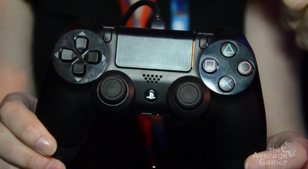
As someone who’s always hated the Dualshock design’s tiny grips, I find that the increased, curved palm grip for the PlayStation 4 controller makes it really comfortable. The concave triggers are obviously a big thing for me as well and the ridged surface on the analogue sticks give much better control and feedback compared to the PS3 versions.
The triggers themselves feel rather dainty but you can confidently maintain solid contact, while the bumpers are much less rattley than the current ones. It all combines into a very nice, secure feeling.
The clickable touchpad is huge, dominating the centre of the controller but due to the way you’ll naturally grip a controller, it’s not easy to reach. You’ll always be have to let go of one side of the controller to do any precision touch work, which rather limits its implementation. Still, it’s a useful feature for menu navigation
You’ll find the speaker below the touchpad. The Wii has had a controller speaker for years and I’ve not yet seen a good implementation in a game. That said, The Playroom, which will ship with all PlayStation 4 consoles, does use it in a very cute way. We’ll have a gameplay video of that up next week.
Xbox One
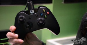
I’m much more comfortable with the asymmetric thumbstick layout of the Xbox 360 and the Xbox One’s controller preserves this. However, the analogue thumbsticks themselves are very small and it does feel very odd. Coupled with a more pronounced (and sharper) ridge, the idea is that you have more precise control. I guess we’ll find out once we get to play actual games on it.
The D-pad has been designed to improve registering and feedback of button presses – each press now has an unmissable click. It’s weird but could ultimately be a good thing. However, it’s now very definitely a cross, lacking the plastic between the directions, so some gamers will need practice on those crucial diagonal moves.
The top of the controller is much larger and clunkier-looking, thanks to the slanted bumpers and the force-feedback triggers. The tech demo we saw merely vibrated the triggers when you held them down, but if developers have enough control over the force and duration of the feedback, it could be entirely possible to imitate the feel of a two-stage trigger or communicate the resistance of a stuck button.
 The face buttons have been refined too. As well as the obvious change to black with a coloured letter (still better than the ridiculous 360 silver controller), there are no longer raised edges around the buttons. The buttons themselves are flatter and closer together, which should make twitch gaming (or QTEs) much easier.
In the video I pointed out the two middle buttons replacing Back and Start. The left one with two boxes is the View button and the right, showing four lines, is the Menu button. These presumably relate to the Xbox One overlays; talking to your friends on Skype and so on. The guide button has been moved up into the chunky new section at the top, so you shouldn’t be able to hit it in a tense moment. No more claiming it was an accident at the crucial point of a match, you cheeky sod. I’ve seen it happen.
So there’s a quick overview of both controllers. I’ve no doubt we’ll see more of them during gamescom in late August, so if there’s anything you want to see, let us know in the comments.


Follow Us!