Dashboards and Metaphors
- Updated: 7th Dec, 2011
So, I don’t normally write about press events because really, who wants to read an article going “We went to this pub right? And they showed us the game and fed us some mini burgers and a drink and we played the game for a few hours, yeah?” ‘Course you don’t. You wanna know about the game.
Last Sunday, however, was so bizarre that I have to tell you about it. We were invited to a place called supperclub in London to learn about the new Xbox dashboard that launched this morning. The doors opened and we were greeted with a large dining hall lined with… beds. Seriously. Beds. Pillows and everything. Check out Nick’s panorama of supperclub.
Unorthodox, but okay. Let’s grab a drink from the bar and roll with it (figuratively speaking). First up – the excitingly-themed starter of “Coronation Street Hot Pot”. Buh? This turned out to be a mild Thai Green Curry with a pie-crust top. Interesting, to be sure. Bit runny maybe, but perfectly palatable. Is Thai Green Curry a big thing on Coronation Street? Enlighten me, readers. I have never knowingly watched the show.
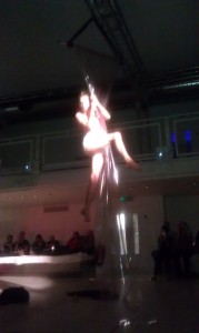
Between courses we had… the entertainment. As we were enjoying our Thai Green Coronation Street, a woman came shimmying out of one of the side doors to music, wearing a leather and lace catsuit. Yup, leather and lace. Well, maybe pleather. I didn’t get close enough to find out. Why? Because this:
This is the part of the dance where she took a hand-held power saw to the front of a guitar. To be fair, she wasn’t a bad dancer, in an ass-wiggling arm-waving kind of way. It was just… we weren’t entirely sure what part of the dashboard this was supposed to represent.
Pressing on, we had the old traditional PR meal – mini burgers. This familiar reprieve from the oddities was quickly broken by the appearance of a new performer. I call him Shower Curtain Man. He was a transvestite who came tottering out in a black ballgown and heels only to strip down to his pants, climb a large plastic sheet, spit some “blood” on it and dangle from the ceiling in a strange plasticated performance art version of aerial silk. The rubber ducky and sheet resembling floor tiles were a nice touch to let us know that he was doing a version of the shower scene from Psycho, but still… even though I’m no stranger to burlesque-style performances, the mind still boggles.
Again, the man was a talented performer and it obviously took a lot of strength to climb a sheet of plastic like that, but why? I’m guessing he was there to represent the new film and TV services coming to the dashboard – Lovefilm, 4 on Demand, blinkbox, Demand 5 and others.
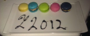
Regardless, we pressed on to the third course built around an Olympic theme, as is unavoidable in London these days. It was macaroons. Lovely!
The green one in the middle? That one has a salsa filling. The blue? Prawn. Red? Guacamole. I’m all for experimental cookery but nooooo. Not like this. I fear that a chef somewhere heard that contrasting flavours were all the rage these days and decided to make them extreme. It did not work. This dish was probably a metaphor for the Sky Sports service with Sky Go. Beautiful on the outside but with a horrifying core. Hmm… can that really be what they meant?
Regardless, the final performance of the day was a nod to the ubiquitous presence of dubsteppers. Fortunately for you, I was holding my camera the wrong way round during that section of the performance so here’s just the latter part, gamepad mime and all.
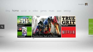
But is the new Xbox Dashboard as innovative as the performances and meals? Well… not really. It’s nice in theory that you can control it with your voice in a Star Trek-esque “Computer!” sort of way. In practice, we find it doing random things when I call “Hey, where’s the Xbox controller” across the room. I do like the return to a horizontal menu system, I don’t like the fact that games are buried in the middle. I like even less the fact that the entire interface appears to be designed around the never-going-to-happen use case of “I turned on my Xbox and I don’t know what I want to do” over happens-every-day situations like “I want to play a game” or “I want to watch a film”.
From a user experience point of view, it’s a terrible design. But it’s great at showcasing the content they want us to see. I guess that’s the important thing, right?


One Comment