On the Oblivion PC interface
- Updated: 30th Mar, 2006
 I’m a PC gamer. We have more than 101 keys. We have mice. We have high-resolution monitors. We have a long, long history of RPG interfaces being progressively refined for usability from the crappy-looking Gold Box games to the Ultima series, through Baldur’s Gate 1 and 2, Dungeon Siege and Morrowind. So why the FUCK have we been shafted with an interface designed for a 12 button controller?
I love Oblivion. I’ve been playing it non-stop all weekend. But the interface is truly godawful.
As said, I have more than 101 keys. Can I map any of them to bring up my inventory at the touch of a button? No. How about the map? No. (More on the map later) Can I map any of the keys? No! Bethesda have declared the keys and be damned to anyone who has played Half-Life and thinks that SpaceBar should be Jump and E should be Action. I can map the commands that already exist, but not additional useful ones like World Map, Local Map, Spell list, etc. Still rubbish! Fortunately not quite as bad as I originally thought.
Inventory: I have a monitor that happily runs 1280×1024 pixel resolution. I’m 30 centimetres from the screen. Why can I only look at 6 items at a time? I don’t need letters 2 cm high telling me that I have steel arrows. Make it smaller! Show me more! Use those unique advantages that mean the PC gaming market is still alive, despite the bugginess and ease of piracy. Using a mouse means precision controlling – I can click directly on small things in a collection of small things. I shouldn’t need to tap through a giant menu. Even if you preserve the general design, you should be able to fit at least 10 items in that space.
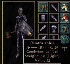
 Let me sort my inventory so I can find my torches instantly instead of scrolling past a hundred raw spell ingredients just to get some light. Give me a paper doll so I can see exactly what I’m holding and wearing instead of making me scroll up and down through my stockpiles of weapons to find out the condition of my equipped sword. The picture of my character is very pretty but am I wearing my enchanted necklace under that giant cuirass? I don’t know. CAN I wear an enchanted necklace under that giant cuirass? I don’t know. How about two necklaces with different enchantments? I Don’t Know!
The in-game map: The in-game map is shite. It doesn’t zoom out, it’s less than half the screen size, I can’t make it bigger and if I want to look north or south around the tiny slice of world that I can see I have to click and drag the top of the tiny map down to the bottom of the tiny map. Repeat ad nauseum. Added to that, (and I realise that this particular part of the rant is entirely my personal preference) it’s not intelligent enough to tell that if I’m pottering about in a city or dungeon I’m a hundred times more likely to want the local area map than the world map and in the countryside I probably want the world map, not the local map. Of course, this feature might be tricky to implement as it stands because for some obscure reason the maps are lumped into the same category as the journal.
Instant travel that progresses game time is nice. I’d like to know beforehand how many days I’m going to lose by using it, but I assume that the game has been designed so that you can’t accidentally miss out on a quest through it, right?
Oh and having the hidden well entrance to the Dark Brotherhood clearly marked on the map as “Dark Brotherhood” when I haven’t touched the well, didn’t know it was openable and certainly didn’t know that it leads to the Dark Brotherhood is just silly.
The journal: Actually, I like the journal. I like being able to choose my active quest and while the marker in the compass is a bit close to dumbing down the exploration and challenge for my liking (particularly with regards to the Thieves’ Guild joining quest), it can be tricky to find things amongst all that grass. Many other developers could learn from this journal. (Deus Ex: Invisible War developers, this means you!) For the current quest we need to know Who wants What and Where to go next. Everything else is optional. Those three are NOT. We also need to know what quests we have already completed because (and I know this is shocking) sometimes we play games through more than once. It’s good to have a reference for what I’ve already completed with this particular character. This journal has everything. Thanks, guys!
Whew, okay. Rant over. I feel much better now :)
[Morrowind paper doll image swiped from this fansite. ]

Pingback: The Lair of the Monkey » The Elder Scrolls: Oblivion User Interface
Pingback: Fixing Oblivion - The Average Gamer
Pingback: 5 Cheap Games That You Should Buy Today - The Average Gamer